
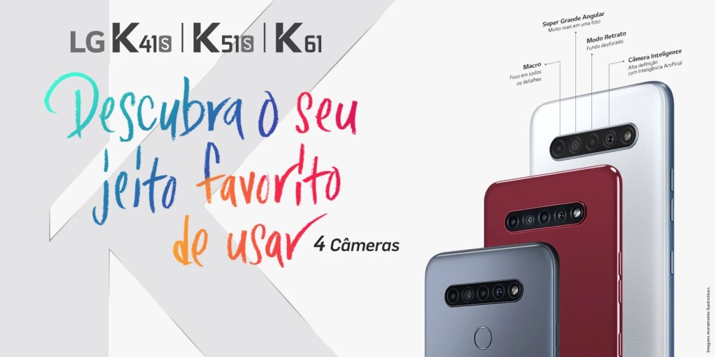
This an design image took out from LG website from Brazil. It shows a new serie of cellphones. It’s a clean design with a good exemple of the design principle and using of colors.
The Design Principles Analysis
Contrast
In contrast principle, the designer make the elements defferent, really diferent. The elements could be color, text fonts, and etc. In the image above, the LG design used the different colors of the cellphones to create this pliciple. However, we can find more contrasts above: the font of the text, the text colors, also the gray and white in background and the other elements.
Alignment
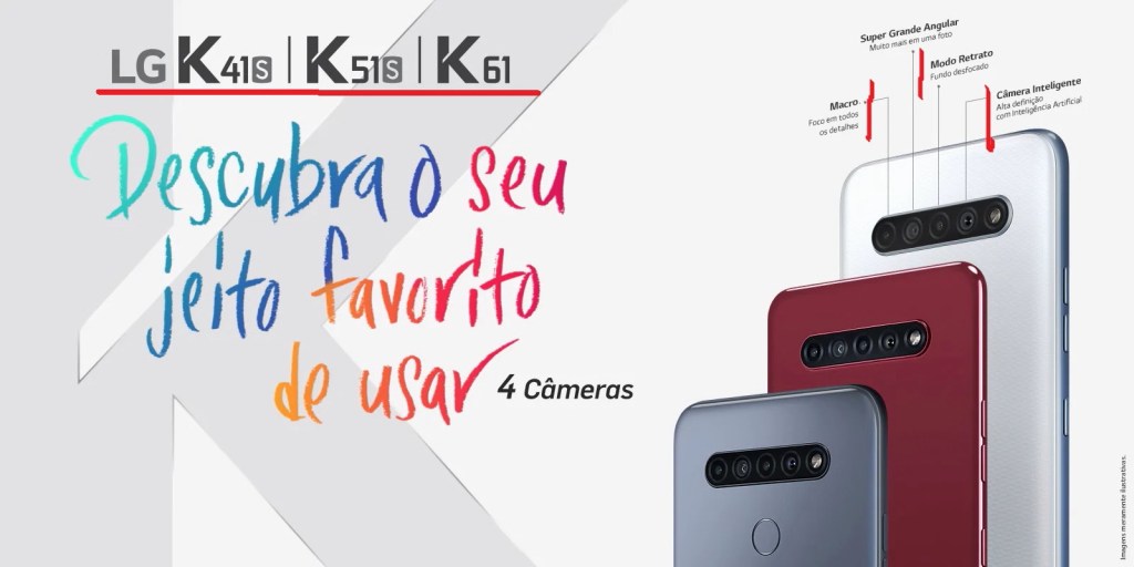
Alignment principle states that the elements in the design has to be aligned. For the example, the designer created alignment in the maked text with the cellphone characteristics and the name of the cellphone models. These elements are pretty organized and neat.
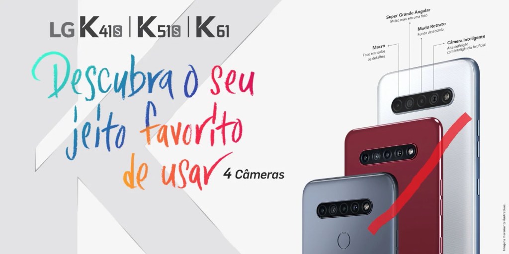
Proximity
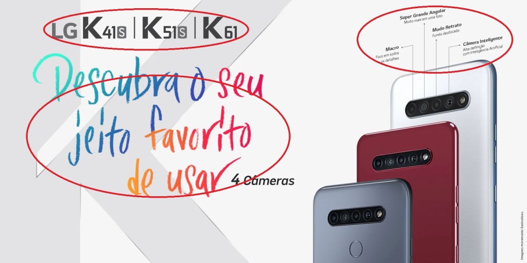
The next principle is proximity. This principle says that all the related items must be phisically closer. In the LG advertisement were marked three diferent groups of texts. They are related. For example, The LG K41s, K51s, and K61 and the models of the cellphone, so they are samentically related.
Repetition

Repetition is a principle that states the elements to repeat in the design. This makes the elements stronger and remindable. Above, there 4 K letters, they repeat in black and in gray in background. Doen’t it look like that LG wants us to know the models of the cellphones?
Colors Analysis
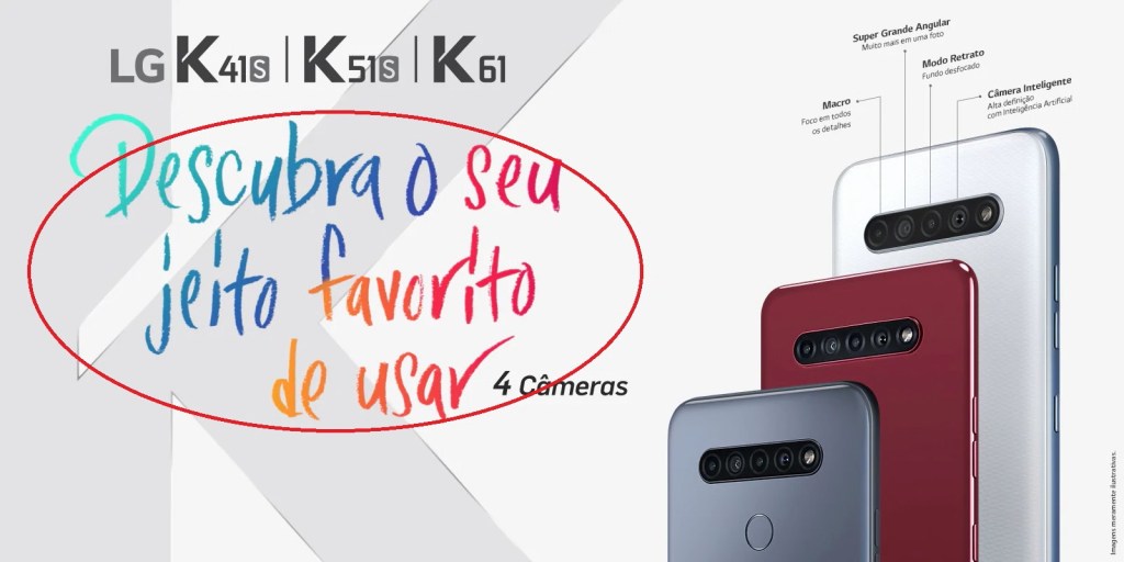
The colors in this design page are really great. Background is grey to make the user pay attention in the slogan that reads: “Find your favorite way to use it”. And all this color make the page more fun and informal. Also, the colors used reflets the color weel, with the primary, sencondary, and tertiary colors. The colors chosen were from green to red or from a cold to a warm color.
Conclusion
Finally, The LG designer chose some ways to use the colors and the design principles. Then, the users can see each of them in the page. Also, the design has an intereting color chosen, as long as repetition principle, which makes the user pay attention on what is the most important to be seen.
